Data Visualization
ELEMENT OF ARTS:
-
Line: Can be curved or straight, thick or thin, vertical, horizontal, or diagonal
-
Shape: 2-dimensional and show contrasts to your data story
-
Color:
- Hue: the color itself
- Intensity: brightness / dullness of the image
- Value: shades or tints of the color
-
Space: The area between, around and in the object. There always be space in visualization
-
Movement: static or dynamic
-
9 Basic Principles of design:
- Balance
The design of data visualization is balanced when the key visual elements, like color and shape, are distributed evenly. This doesn't mean that you need complete symmetry, but your visualization shouldn't have one side distracting from the other. If your data visualization is balanced, this could mean that the lines used to create the graphics are similar in length on both sides, or that the space between objects is equal. - Emphasis
Your data visualization should have a focal point, so that your audience knows where to concentrate. In other words, your visualizations should emphasize the most important data so that users recognize it first. Using color and value is one effective way to make this happen. By using contrasting colors, you can make certain that graphic elements - and the data shown in those elements - stand out. - Movement
Movement can refer to the path the viewer's eye travels as they look at a data visualization, or literal movement created by animations. Movement in data visualization should mimic the way people usually read. You can use lines and colors to pull the viewer's attention across the page. - Pattern
You can use similar shapes and colors to create patterns in your data visualization. This can be useful in a lot of different ways. For example, you can use patterns to highlight similarities between different data sets, or break up a pattern with a unique shape, color, or line to create more emphasis.
- Repetition
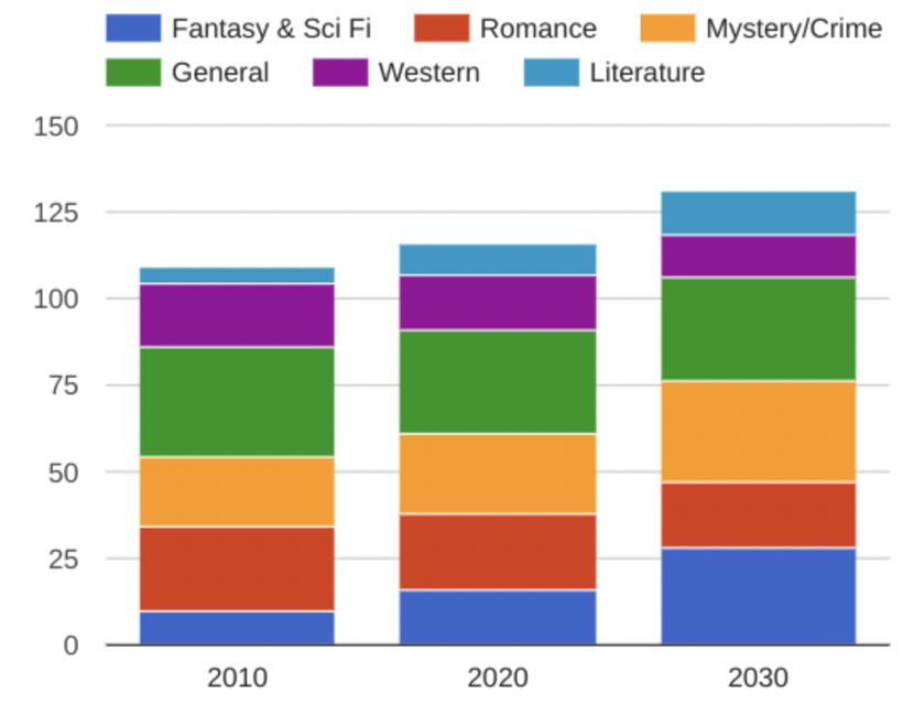
Repeating chart types, shapes, or colors adds to the effectiveness of your visualization. Think about the book sales chart from the previous example: the repetition of the colors helps the audience understand that there are distinct sets of data. You may notice this repetition in all of the examples we have reviewed so far. - Proportion
Proportion is another way that you can demonstrate the importance of certain data. Using various colors and sizes helps demonstrate that you are calling attention to a specific visual over others.If you make on chart in a dashboard larger than the others, then you are calling attention to it. It is important to make sure that each chart accurately reflects and visualizes the relationship among the values in it.
These first principles of design are key considerations that you can make while you are creating your data visualization. These next three principles are useful checks once your data visualization is finished. - Rhythm:
This refers to creating a sense of movement or flow in your visualization. Rhythm is closely tied to the movement principle. If you finished design doesn't successfully create a flow, you might want to rearrange some of the elements to improve the rhythm. - Variety
Your visualization should have some variety in the chart types, lines, shapes, colors, and values you use. Variety keeps the audience engaged. But it is good to find balance since too much variety can confuse people. The variety you include should make your dashboards and other visualizations feel interesting and unified. - Unity
The last principle is unity. This means that your final data visualization should be cohesive. If the visual is disjoined or not well organized, it will be confusing and overwhelming.
- Balance
-
Data composition: Combining the individual parts in a visualization and displaying them together as a whole.
-
**Four elements of successful visualizations
- Information (data): The information or data that you are trying to convey is a key building block for your data visualization. Without information data, you cannot communicate your findings successfully.
- Story (concept): Story allows you to share your data in meaningful and interesting ways. Without a story, your visualization is informative, but not really inspiring.
- Goal (function): The goal of your data visualization makes the data useful and usable. This is what you are trying to achieve with your visualization. Without a goal, your visualization might still be informative, but can't generate actionable insights.
- Visual form (metaphor): The visual from element is what gives your data visualization structure and makes it beautiful. Without visual form, your data is not visualized yet.
-
5 phases of the design process:
- Empathize: Think about the emotions and needs of the target audience of your data viz. (stakeholders, team members, general public)
- Define: Determine which data to show in your data viz.
- Ideate: Use ideas from empathize and define stage to create data viz. solutions.
- Prototype : Create many visualization to choose from
- Test : Test their functionality
-
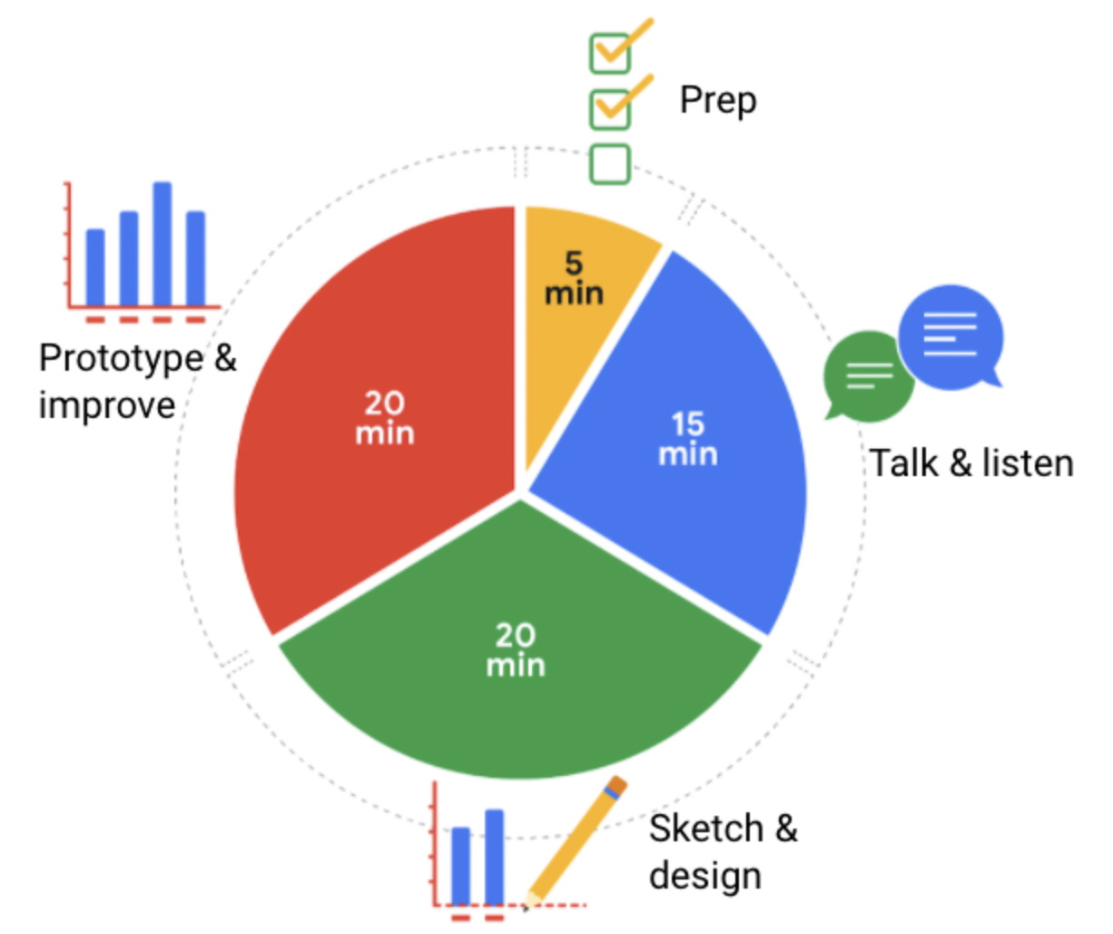
Design a chart in 60 minutes

-
Prep (5 min): Create the mental and physical space necessary for an environment of comprehensive thinking. This means allowing yourself room to brainstorm how you want your data to appear while considering the amount and type of data that you have.
-
Talk and listen (15 min): Identify the object of your work by getting to the "ask behind the ask" and establishing expectations. Ask questions and really concentrate on feedback from stakeholders regarding your projects to help you hone how to lay out your data
-
Sketch and design (20 min): Draft your approach to the problem. Define the timing and output of your work to get a clear and concise idea of what you are doing
-
Prototype and improve(20 min): Generate a visual solution and gauge its effectiveness at accurately communicating your data. Take your time and repeat the process until a final visual produced. It is alright if you go through several visuals until you find the perfect fit.
Types of Visualizations in Tableau:
-
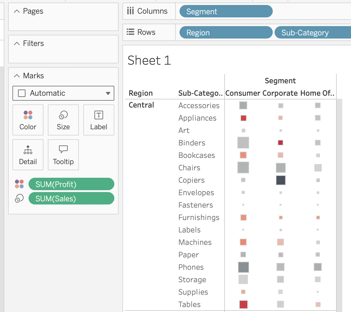
Highlight tables

-
Heat maps
-
Density maps
-
Gnatt charts

-
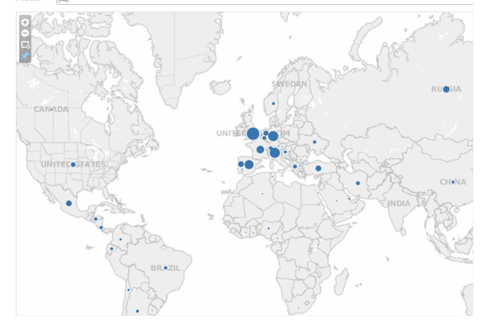
Symbol maps

Note that we can zoom in deeper to regional or each country. -
Filled maps
-
Circle views
-
Box plots
-
Bullet graphs
-
Packed bubble charts
-
Design Principles
| Principle | Description |
|---|---|
| Choose the right visual | One of the first things you have to decide is which visual will be the most effective for your audience. Sometimes, a simple table is the best visualization. Other times, you need a more complex visualization to illustrate your point. |
| Optimize the data-ink ratio | The data-ink entails focusing on the part of the visual that is essential to understanding the point of the chart. Try to minimize non-data ink like boxes around lengends or shadows to optimize the data-ink ratio. |
| Use orientation effectively | Make sure the written components of the visual, like the labels on a bar chart, are easy to read. You can change the orientation of your visual to make it easier to read and understand. |
| Color | There are a lot of important considerations when thinking about using color in your visuals. These include using color consciously and meaningfully, staying consistent throughout your visuals, being considerate of what colors mean to different people, and using inclusive color scales that make sense for everyone viewing them. |
| Numbers of elements | Think about how many elements you include in any visual. If your visualization uses lines, try to plot five or fewer. If that isn't possible, use color or hue to emphasize important lines. Also, when using visuals like pie charts, try to keep the number of segments to less than seven since too many elements can be distracting. |
| What to avoid | Why |
|---|---|
| Cutting off the y-axis | Changing the scale on the y-axis can make the differences between different groups in your data seem more dramatic, even if the difference is actually quite small. |
| Misleading use of a dual y-axis | Using a dual y-axis without clearly labeling it in your data visualization can create extremely misleading charts. |
| Artificially limiting the scope of the data | If you only consider the part of the data that confirms your analysis, your visualizations will be misleading because they don't take all of the data into account. |
| Problematic choices in how data is binned or grouped | It is important to make sure that the way you are grouping data isn't misleading or misrepresenting your data and disguising important trends and insights |
| Using part-to-whole visuals when the totals do not sum up approprately | If you are using a part-to-whole visual like a pie chart to explain your data, the individual parts should add up to equal 100%. If they don't, your data visualization will be misleading |
| Hiding trends in cumulative charts | Creating a cumulative chart can disguise more insightful trends by making the scale of the visualization too large to track any changes over time. |
| Artificially smoothing trends | Adding smooth trend lines between points in a scatter plot can make it easier to read that plot, but replacing the points with just the line can actually make it appear that the point is more connected over time than it actually was. |
-
Dashboard: A tool that organizes information from multiple datasets into one central location for tracking analysis, and simple visualization
-
3 data storytelling steps:
- Engage your audience:
- Identify your audience
- Understand what internal stakeholders want from the project
- Seek to capture the audience's attention on an intellectual and emotional level
- Create compelling visuals:
- Visual should be clear and able to stand on their own
- Highlight the meaning behind the numbers at a glance
- Incorporate some interactive layered data so the curious can explore
- Tell the story in an interesting narrative:
- Choose a primary message/spotlight
- Clearly articulate recurring themes and data points
- Provide recommendation at the end.
- Engage your audience:
-
Questions before creating a visualization for audience:
- What role does this audience play?
- What is their stake in the project?
- What do they hope to get from the data insight I deliver?
-
Spotlighting: Scanning through data to quickly identify the most important insights.
-
The narratives to share with stakeholders:
- Character: People who are affected by your story (stakeholders, clients)
- Setting: Describe what's going on, how often it's happening, what tasks are involved and other background information about the project.
- Plot: Is the conflict or what creates the tension in the current situation (new challenge from competitor, an inefficiency that needs to be fixed, or a new opportunity that the company just can't pass up)
- Big Reveal: The resolution that your data has solved for the business
- Aha moment: Share your recommendations and explain why you think you help your company be successful.
-
Evaluation criteria:
- Include a title, subtitle, and date: Making sure that your slide deck presentation has a title, subtitle, and date makes sure that your audience knows exactly what you are presenting and when the information was from. That way they know it's relevant and current to them.
- Use a logical sequence of slides: Organizing your slides in an order that makes sense guides your audience through your narrative, building understanding step-by-step
- Provide an agenda with a timeline: An agenda offers a roadmap of your presentation, allowing your audience to follow along and anticipate key topics.
- Limit the amount of text on slides: Keeping text brief ensures clarity and retains the audience's attention; aim for your audience to scan it within 5 seconds.
- Start with the business task: By immediately relating the content to the business task at hand, you contextualize your information, making it relevant and actionable.
- Establish the initial hypothesis: Presenting an initial hypothesis gives your audience a starting point for what to expect and frames the subsequent analysis.
- Show what business metrics you used: Clarifying which metrics you're analyzing validates your arguments and helps the audience gauge your presentation's relevance to business outcomes.
- Use visualizations: Visual aids can illustrate complex data more effectively than text alone, making your message more accessible.
- Introduce the graphic by name: A brief introduction to each graphics aids in understanding and retaining information
- Provide a title for each graph: Titles act as signposts, helping the audience quickly grasp the meaning of each visual.
- Go from the general to the specific: Starting with a broad overview before diving into details ensures that all audience members are on the same page.
- Use speaker notes to help you remember talking points: Notes act as your cue cards, enabling a smoother delivery and ensuring no critical point is missed.
- Include key takeaways: Summarizing the main points at the end of your presentation reinforces the message and ensures the audience leaves with the intended takeaways
-
Example of storytelling: "We began by creating a a heat map of the happiness score for each country, where the number within each country represents the overall score and the colors represent how high or how low the score is on a scale "
-
Proven tips for presentation:
- Channel your excitement
- Start with a broader idea (ex: our goal today...)
- Use 5 seconds rule
- Wait 5 seconds after showing a data visualization
- Ask if they understand
- Give your audience another 5 seconds
- Tell them the conclusion
-
Preparation is key
-
McCandless Method:
- Introduce the graphic by name
- Answer obvious questions before they are asked
- State the insight of your graphic
- Call out data to support that insight
- Tell your audience why it matters
TIPS FOR BETTER PRESENTATION:
What is the purpose of my presentation:
- If the goal of your presentation is to request or recommend something at the end, like a sales pitch, you can have each slide work toward the recommendations at the end.
- If the goal of your presentation is to focus on the results of your analysis, each slide can help mark the path to the results. Be sure to include plenty of breadcrumbs (views of the data analysis steps) to demonstrate the path you took with the data.
- If the goal of your presentation is to provide a report on the data analysis, your slides should clearly summarize your data and key findings. In this case, it is alright to let the data be the star or speak for itself.
Prepare talking points and limit text on slides:
- Keep talking point on speaker's note
- Avoid summarizing data on slides
- Apply 5-seconds rule to text-on-slide
End with recommendation:
- Use one slide for your recommendations at the end. Be clear and concise.
- If you are recommending that something be done, provide next steps and describe what you would consider a successful outcome.
Allow enough time for the presentation and questions:
- Presenting your data efficiently. Make sure that every slide tells a unique and important part of your data story.
- Saving enough time for questions at the end or allowing enough time to answer questions throughout your presentation.
LAYOUT:
- First slide: Agenda:
- Introductions
- Project overview and goals
- Data and analysis
- Recommendations
- Actionable steps
- Questions - Second slide: Purpose
Summarize the purpose of the project and why it is important to the business for your audience. - Third slide: Data/analysis
- Slides typically have a logical order (beginning, middle, and end) to fully build the story.
- Each slide should logically introduce the slide that follows it. Visual cues from the slides or verbal cues from your talking points should let the audience know when you will go onto the next slide.
- Remember not to use too much text on the slides. When in doubt, refer back to the second tip on preparing talking points and limiting the text on slides.
- For extra visual:
- Fade in one bullet point at a time as you discuss each on a slide
- Only display the visual that is relevant to what you are talking about (fade out non -relevant visuals)
- Use arrows or callouts to point to a specific area of a visual that you are using. - Fourth slide: Recommendations
- Fifth slide: Call to action
SELF-CHECK:
-
Do I use an attention-grabbing opening?
-
Do I start with broad ideas and later talk about specific details?
-
Do I speak in short sentences?
-
Do I pause for five seconds after showing a data visualization?
-
Do I pause intentionally at certain points?
-
Do I keep the pitch of my sentences level?
-
Do I stand still and move with purpose?
-
Do I have good posture?
-
Do I look at my audience (or camera) while speaking?
-
Do I keep my message concise?
-
Do I end by explaining to my audience why the data analysis matters?
You can also add checklist items that help you refine your slide deck:
-
Do I include a good title and subtitle that describes what I’m about to present?
-
Do I include the date of my presentation or the date when my slideshow was last updated?
-
Does my font size let the audience easily read my slides?
-
Do I showcase what business metrics I used?
-
Do I include effective visuals (like charts and graphs)?
PREPARE FOR THE Q&A:
-
Before the presentation:
- Assemble and prepare your questions.
- Discuss your presentation with your manager, other analyst, or other friendly contacts in your organization.
- Ask a manager or other analysts what sort of questions were normally asked by your specific audience in the past.
- Seek comments, feedback, and questions on the deck or the document of your analysis.
- At least 24 hours ahead of the presentation, try and brainstorm tricky questions or unclear parts you may come across- this helps avoid surprises
- It never hurts to practice what you will be presenting, to account for any missing information or simply to calm your nerve. -
During the presentation:
- Be prepared to respond to the things that you find and effectively and accurately explain your findings.
- Address potential questions that may come up
- Avoid having a single question derail a presentation and propose following-up offline
- Put supplementary visualizations and content in the appendix to help answer questions.
Types of objections
- About the data
Where you got the data?
What systems it came from?
What transformations happened to it?
How fresh and accurate is the data? - About your analysis
Is your analysis reproducible?
Who did you get feedback from? - About your findings
Do these findings exist in previous time periods?
Did you control for the differences in your data?
How to handle Q&A
- Listen to the whole question
- Repeat the question if necessary
- Understand the context
- Involve the whole audience
- Keep your responses short and to the point
Important aspects to a presentation
- Define your purpose
- Keep it concise
- Have some logical flow to your presentation
- Make the presentation visually compelling
- How easy is it to understand?